
The Navigation tab controls how users traverse your app. ZenAppBuilder supports two primary navigation styles that can work together.
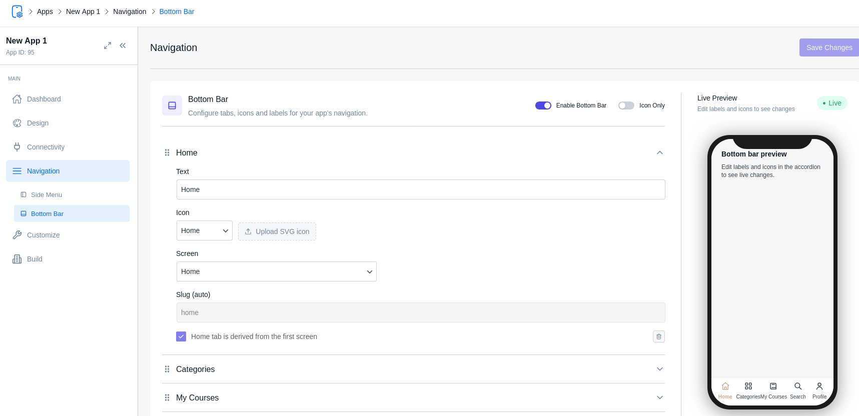
- Bottom Tab Bar
The most common navigation pattern for mobile apps. It provides quick access to your app’s main sections.
- Items: You can add up to 5 tabs.
- Labels: The text shown below the icon.
- Icons: Choose from a library of 20+ professional icons (Home, Search, Profile, etc.).
- Link to Screen: Select which Screen slug the tab should navigate to.
- Style: Choose between “Standard” (fixed) or “Floating” (pill-shaped) variants in the Design > Themes tab.
- Side Menu (Drawer)
The Side Menu is a hidden drawer that slides out from the left. It’s perfect for secondary links like “About Us,” “Settings,” or “Privacy Policy.”
- Enable Side Menu: Toggle this to add a menu icon to your Top Navbar.
- Items: Add links to any of your screens.
- Auto-Populate: Screens with the navSlot set to sidemenu in the Customizer will automatically appear here.
Navigation Slots (navSlot)
In the Customizer, every screen has a navSlot property. This tells the app where the screen lives:
- Tabbar: The screen is one of the main bottom tabs.
- Sidemenu: The screen is accessible via the side drawer.
- Hidden: The screen is “detached.” It can only be reached via a button click, a link, or a notification. This is ideal for Detail pages or special forms.

- Tab Bar Visibility
You can choose to hide the bottom tab bar on specific screens (e.g., a checkout screen or a fullscreen video) by toggling the Show Tab Bar setting in that screen’s property panel.